Thursday 31 March 2011

It's Not A Vector~

I'm not a great illustrator, I'm not even an incentive one. I'm quite bland in that aspect really.
However, one thing I am not is a vector artist. Someone pointed out not too long that because I prominently used the pen tool in photoshop to create my digital lines means that I was creating a vector (and clearly nothing else.)

I pointed out that a) you can't create vectors in photoshop as it is a bitmap program and not a vector program like illustrator. Example:


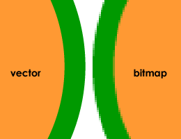
On the right is a zoomed in shape created in a bitmap program such as Photoshop. The one on the left is created in a vector like program.

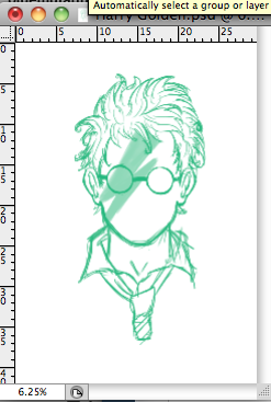
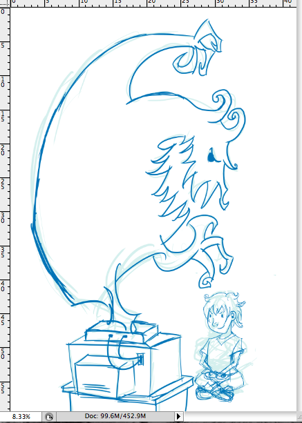
My b) point (or should that be 2nd?) is that I wasn't comfortable enough to create lines without the pen tool. I'm still not, but I have been practicing:


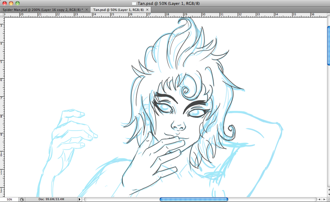
And by my lines being 'messy', I sill haven't quite got the motor control to make them neat. I guess that's why with some of my work I've started to use the messier approach to digitally inking. (and it's proving quicker, which is an added bonus.)


Also, bitmap!
This is at 200% so here's hoping it will look neater when scaled down to the size the client wants it at.

Arms a plenty~

I'm trying to keep to the specific guidelines set down by the client which was "more arms", other than that, I think they're keen for me to keep going.

I'd been putting off this brief because I was waiting for confirmation from the client, but now I have it and I can finish this up by the week is out.

There are a few things I want to address such as making him seem more mythical and less like half a demon god stuck to a poor decapitated black window. (as that was the spider I was basing the body on.)

Edit: I can't draw hands all that well. I think two of them have been attached together at the elbow. Whoops.

Wednesday 30 March 2011

Golden Boy

I've decided to scrap the idea of using a cartoonish style for the potter posters as seen in this post. I'm still making the house's and the Marauders map prints but for the other ones, I'm going to concentrate of characters. (because that's what my design practice is.)
Original Sketch.
Start of the inking process.
Harry and his crazy hair.
Adding more shade in the form of the lines.
His hair was a little too crazy and was taking away from the rest of the image.


Golden Boy

So this has been done a thousand times over BUT ...

I need help deciding what the 'lighting bolt scar' should be in terms of Ancient Runes. (Nah, I'm not giving the poor boy a Bowie bolt, that's been done and done)

I sort of decided around book 4 that Harry's scar was not a lightning bolt, but a rune. Good one JK. Obscure. (Nah, loads of people guessed that.) BUT. I'm in 2 minds about which rune it is.

Either I covert it to Sowilo, which was my original intention. Or to Eihwaz, which also has potential to be the scar rune. (And the one Hermione starts talking about when she mixes up her runes)

This is Sowilo :


Pretty freaking close, huh? And it means "The sun" :

Success, goals achieved, honor. The life-force, health. A time when power will be available to you for positive changes in your life, victory, health, and success. Contact between the higher self and the unconscious. Wholeness, power, elemental force, sword of flame, cleansing fire. Sowilo Merkstave (Sowilo cannot be reversed, but may lie in opposition): False goals, bad counsel, false success, gullibility, loss of goals. Destruction, retribution, justice, casting down of vanity. Wrath of god.

And Eihwaz "Yew-Tree" which makes a little bit more sense. :


Oh lighting bolt shaped runes, you spoil us.

This rune means Yew tree and of course Voldemorts original wand was made of yew (the only one to have ever been apparently.)

Strength, reliability, dependability, trustworthiness. Enlightenment, endurance. Defense, protection. The driving force to acquire, providing motivation and a sense of purpose. Indicates that you have set your sights on a reasonable target and can achieve your goals. An honest man who can be relied upon. Eihwaz Reversed or Merkstave: Confusion, destruction, dissatisfaction, weakness.

So which Rune do I give him?

I'm also doing one for Hermione and Ron (But that's giving me a headache because the runes I've proposed for them are both very similar...meh.)

Bowie Bolt


I'm not the only one to think of the Bowie Bolt idea for Harry Potter. Wouldn't take a genius to put two and two together. But that's not what my illustrations of the character are about. It's about how appearance is first judged (something that ties into my stereotypes brief) and how no one knew how this little boy ever defeated the darkest wizard. And that a lot of people did not think he was capable and never saw past the scar.

Punk 2


Punk (again) but this time in the same style as the Lolita and Dub Step.
(This time without the face.) If you didn't know all ready then you would not have guessed that the style of the character design had changed from the initial idea.

Dub Step DPS

Lines for "dub step". The same process used on Lolita was used across the range of characters.

Both Dub Step and Lolita before I decided to get rid of the black box at their feet. (Also slightly altered the alignment of the insult for DS)


Before the colour overlay (which was always going to be orange.)


After the colour over lay.

Tuesday 29 March 2011

Character Sketches

Character sketches so far. Ignoring Gothic Lolita 'cos I've already finished her. They all had faces originally, it wasn't until afterward that I decided to give the characters a more mannequin feel.

Mascot Update~

I fixed the mascots face, his body is still looking a little twisted but that could just be the angle he's at. I need to add the four other arms, finish the draft and send it off to the client for approval.(or too see if there are any changes) before I can ink and colour. Then hopefully that's another small brief down.

Ghoulish

Reading up about the invention that Disney has made to fool gamers into believing there are thing's on their skin when they play reminded me more and more of something far sinister. If they can make you feel something internally like fear, then the next step is to make that fear external. That was the idea for this illustration.

Child playing with a tv and games console. (An older box like tv because what parent would give a child a flat screen) And a terrible looking ghoul/ghost/national lottery thing.

The ghoul coming up and out of the games console.
\
Centralised the image and made the composition a little easier on the eyes.


Yup, changed it to a flat screen.

New Article

New Scientist article I've recently found to illustrate and I've think I have a good idea for it.

Monday 28 March 2011

Brief 8: Mid Way Point


I've come to realise over the course of the day (and whilst working on one of the more illustrative pieces) that I can't screen print all of the posters. It's going to eat too much into the time allotted for this brief.

So my solution is to screen print 5 of the posters which will include all four houses and the marauders quote. One colour plus stock to give it that tactile feel. They'll work as a set with their limited colour and similar feel.

The more illustrative pieces have a differnt feel to them. They tap into the whimsical side of the series and though they're still going to be limited colour I would prefer to make them digitally printed. (I am looking to print on the same stock as the other five so they still tie together yet can be seen as a different set.)

We'll see how this goes. ~

Sunday 27 March 2011

Ron

For the ferret quote it's Ron who's imaging Draco as the amazing bouncing ferret and I wanted him on the banner as well. So It'll be a composite of Ron, Ferret and the quote. Somehow.

Technically, It's a ferret~

"Don't talk to me."
"Why not?"
"Because I want to fix that in my memory for ever. Draco Malfoy, the amazing bouncing ferret..."

This was one of the quotes I was going to drop because I started to draw a terrible excuse for a ferret and it was not getting any better. Then I took a step back, remembered back to when I had ferrets as pets and always thought they looked like elongated cats. So that's pretty much what I drew for Draco the ferret.

Started with the shapes of the ferret. Which are triangles and ovals.

Rough outline. Ferrets tails are not that big, I just felt incredibly sorry for his inadequacy (and the fact that he's being bounced around like a rubber ball)

One bouncing Malfoy ferret.


Spider whiskers~

Little things are always going to change during the inking process. He looked a little strange with a great black void in his mouth so I opted for a smaller (and hopefully startled into silence) look.

Gothic Lolita DPS


The screen cap at the top was how the DPS was originally going to look and I'm not really sure why I had the black space there to begin with. I think it was so her feet did not get lost in the background. However, I found that the whole composition looked better without it.

Banner~


Almost there with the Slytherin print. I think this is the layout I'm to go with for this banner (and the other 3 houses)

They're still half an A2 so all ten will be able to exist together without taking up too much wall space. (Keeping in mind the little space people offer over to movie posters) Also taking into consideration the A1 size full posters you can buy which dominate walls. I wanted something smaller but with the just the same impact.

Saturday 26 March 2011

Gothic Lolita Type

I started off by looking at gothic type faces that I could adapt. The L's and T's are hard to read but I managed to adapt them without changing the type face too much.