Saturday 29 January 2011

One to One Tutorial

My one to tutorial yesterday with Fred went well and now I know exactly what I need to do in order achieve a good body of work for my portfolio. Knowing that my last module work could have been 1st material is the kind of push I need right now. I was disappointed with my over all grade, especially after receiving a 1st for the last project before summer. If I can apply what I did in that module to this one then I will be heading in the right direction.


I need to remember that I am not a script writer and that I should not be trying to create stories for my character designs but basing them around questions. This is what worked in the 2nd year because I was asking questions about langauge and dialect and forming characters around my findings.

So, I need to re work some of my briefs, re write my SOI.

Monday 24 January 2011

Brief 1: update

For the next 2 weeks I'll be working on the assets for the '59 graphic novel but of course I'm going to be working on my Lesser of 3 Evils brief, I just need to take a step back from it for a few days. (It'll be there in the background.)

Things to do for this brief:
- Finish Dee's 3 point turn (colouring wise)
- Trev's 3 point turn
- Trev's colour pallet
- FIX TREVS FACE
- Addison's height/3 point turn and colour pallet.

Then costumes, clothing and weaponry.

The graphic novel brief is pretty much what I'm doing now minus them being my own characters and there is a heck of a lot more of them. Hopefully I'm not going to go insane.

All '59 graphic novel related briefs/posts will not be uploaded on this blog. Please see off line blog.

Thanks.

Saturday 22 January 2011

Brief 1: 3 Point Turn; Dee-Ell

I should have been working on Addison's height and body shape but ended up doing Dee-Ell's 3 point (and a bit) turn. This isn't finished and if I'm being honesty I'm getting a little twitchy without a crit (and my briefs haven't exactly been confirmed). However, I'm quite pleased with how this brief is going so far and hopefully I can push it further in the coming weeks. (and that I will not loose track of it and the point behind it.)

I mentioned in a previous post about having certain colour pallets corresponding to specific characters. These are Dee's initial colours which are a bit more yellow that I was expecting, however, I'm going to play around with them and see what I come up up with.

His Deisgn also isn't final. I'm now thinking of not giving him hair, but a few additional feature such as the ridges on his nose and ports on his neck. (Which are not very clear at the moment). Hopefully I'm not going to hung up on the finer details.

Brief 1: Addison Expressions


Addison Expressions, tried to keep him on parr with the other two as not to look to young. I'm going to sketch out his height next and put it in realtion to the other two.

To do:
- 3 point turn around's for both body and head of all 3 characters
- Colour pallet
- costume design (uniform, casual, anti-hero costumes)
- Weapons (Dee's ray gun)

I'm hoping to have all of this done by tomorrow which means I'm at a nice clean cut of point to work on the graphic novel assets before I come back and neaten up this brief. (And work on story boards ect)

Case Study: Matt Wagner

Wagner has worked on comics featuring The Demon and Batman as well as such titles as Sandman Mystery Theatre and Trinity, a DC Comics limited series featuring Batman, Superman, and Wonder Woman. He also has a creator-owned series' Mage and Grendel.

Recent projects include Madame Xanadu for Vertigo, with artist Amy Reeder Hadley. He has also produced numerous comics covers, including painted ones for Green Arrow. Currently, Wagner is writing a Green Hornet spin-off (one of several) for Dynamite Entertainment.

What I want to show are his character turn arounds as I think these are more appropriate to my work rather than his other work. (Which is still just as great)


This is something I am going to implement into my character design showing detailed turnarounds. This is useful for both character design and toy design (if I ever wish to go down that route)

Friday 21 January 2011

Brief 1: Character 3

Initial sketches for Addison, the final character. I was not expecting him to look so young (despite being the youngest character). The idea behind him is to not judge a book by it's cover. He may be young and innocent looking but I'm under the assumption (so far) that he's the one to look out for. Started off with a very flat chin, the same proportions you would give a child. However, Addi is a teenager and so has started develop a chin which is apparent in the 2nd and 3rd sketches.

Sketch wise, the middle one looked too much like a hobbit and I decided on keeping his eyes hollow to keep in running with the other 2. (Dee's are black, Trevor's are smaller in correspondence with his age and ethnicity)

Thursday 20 January 2011

Brief 4: Live Brief


Currently corresponding with an author who wants a few character designs for their fiction website. While it's not a safe for work website (and still in the process in getting itself up and running) it is something I am interested in taking on. I'm also in discussion with this being a long term side project in which I'm paid for doing the art work for the site.

I'm going to write a brief this weekend for the client to agree with and then I can get started on initial ideas and concepts.

Brief 3: Collaboration with Jonny P


Initial ideas for a brief Jonny P and I are collaborating on and hoping to approach Nobrow with. Jonny has already sent an email inquiring into paper stock and what limitations they use when producing work. At the moment it looks as if we will both be illustrating the characters and that Jonny will be placing it together. More to work out tomorrow and it should all work together once we have the brief written up in full.

Brief 1: Trevor Expresions


Quick expressions of Trevor I did this afternoon/evening. I realise I'm worrying too much about the state of his front view when it really is not that much of a problem. Now that I have a variety of expressions for him I can go back and re work the face if needs be.

Upon reflection, I've noticed several things about this style I'm working in. It's based upon the one I developed last summer based on my Icon and the X-woman head shots. I like it, I'm just worried that my different art styles means I'm not going to be noticed that easily. I do enjoy working differently because the subject matter will always dictate how I draw. This is something I'm going to ask about in my portfolio review tomorrow with Mark Howe and at next weeks one to one tutorials.

(However, A contact I've been discussing a live brief with liked this aspect of my art, I'm just waiting on them to get back to me.)


(I think perhaps it's the big eyes which are leading me to believe that I am drawing Megamind and not Trevor.)

Case Study: Barry Reynolds


Barry Reynolds is a Dublin-born character designer, animator and illustrator who studied classical animation and has worked for numerous animation studios across Europe. Most recently he worked as the lead character designer for the Oscar and Annie award nominated animated feature film The Secret of Kells, (see previous post), which was the first feature film to be produced by the Cartoon Saloon animation studio. Subsequently, he was nominated for an NCS Reuben Award for Feature Animation in 2010 for his work as the character designer on 'Kells'.


Reynolds also has two Irish language comics written by Colmán Ó Raghallaigh and published by Cló Mhaigh Eo - An Táin ("the cattle-raid", 2006), adapting the ancient Irish epic Táin Bó Cúailnge ("the cattle-raid of Cooley"), in which queen Méabh of Connacht invades Ulster to steal the bull Donn Cuailgne, opposed by the teenage Ulster hero Cú Chulainn; and Deirdre agus Mic Uisnigh ("Deirdre and the sons of Uisnech", 2008), with Audrey O'Brien as colourist and letterist, adapting the legend of the tragic heroine who was chosen as a child to marry the king, but falls in love with a young hero.


Reynolds concept art and character sheets are certainly something I'm taking on board with my design practice. I like the simple and easy colour pallet for Brendons design and It is something I'm going to incorporate into my own work.

The Secret Of Kells

The Secret of Kells is an Irish-French-Belgian animated feature film by Cartoon Saloon that premiered on February 8, 2009, at the Berlin International Film Festival.The story is set in the ninth century and gives a fictionalized account of the creation of the Book of Kells, an illuminated manuscript and known today as one of Ireland's greatest national treasures.

(One of my favourite scenes in which Brendon fights an deep sea creature with a stick of chalk, causing it to eat itself through frustration.)

It's animation is superb and the character designs are so unique with elongated shaped and general abstract feel. It's beautiful and eye popping with characters that made me sit up and take notice of their form and function.


Brief 1: 2 character height

Height charts for both Dee and Trevor together. Managed to make Trevor not look so squished anymore and fleshed his arms out a little bit. It's looking likely that Dee will end up bald but I think I can work with that.

I aim to have a few of Trevor's expressions done later on today but that's as far as I'm going with him. I don't want to spend to long trying to fix his face because I'm not happy with it. This is something I can come back to a later date and change if I still feel the same way.

Case Study: Sean Galloway


Sean Galloway

"They told me that ‘cartoonists’ don’t make money, only Graphic Designers, and Fine artists do. I didn’t want them to crush my dream, of drawing in the comic book industry, so I quit the college and pursued my art journey by drawing everyday. So to sum it up, I’m self-taught."


Sean is a cartoonist/comic book artist and character designer who has worked on projects such as Marvel Comics; Venom #13 (fill-in penciller), DC Comics; Teen Titans Go (cover artist (issue 16 to present), and interior art for issue #22), Axiom Comics; Fatboy and Harvey (cover artist), Massive Black Inc.; conceptual art (designs and colors),Sharon Scott; character development. To name just a few of his achievements.


He's someone I admire for their determination to do what they love and not let something like a college degree get in the way. It's a style that refreshing, abstract with out being to ludicrous and obviously someone who is passionate about what they do. If anything, this is the mind set I want to get into. Of course I'm passionate about what I do but I still haven't quite tipped the peak yet, so to speak.

Wednesday 19 January 2011

Brief 1: Trevor

I'm still not happy with this front view but I can work with it for now. I think I'm going to concentrate on his expressions, learning how to drawn Mohawks and trying to keep him consistent. (I honestly think its the hair again that's letting me down. Unless I do something about this I'm going to end up with a lot of bald characters.)

The problem I had before with Dee looking too tall is the complete opposite for Trevor, who now looks to short. I'll sort that out in the morning.

Brief 1: Character 2

A very quick sketch of the 2nd character; Trevor. A reason I didn't want to do the Disney brief (apart from not being an animator) was the "no heritage characters" line. So Trevor's half Native American half Arabic. He's the "muscle" character who could be quite intelligent if he only put his mind to it.

Edit: Re-worked Trevor as to make him older, his eyes more expressive and a thinner face.

There is still something a little off about him, but it could be that he's looking a little lop sided. I'll try again later when I make some expression and facial structure poses.

Last Module Feedback // Grade

Design Practice 3: OUGD 301 feedback.

"The level of practical and visual experimentation is good but inconsistent resulting in a body of work that lacks clear focus and direction. A more critically aware approach to the development of initial ideas would help you to exploit the potential in your work more consistently."

If I'm being perfectly honest, I was expecting a worse grade. I struggled to get myself of the ground for the fist module of this year and this has impacted my grade significantly. My inability to time keep and keep a record of this also contributed to the grade.

"A more organised approach to your studies would allow you to develop a more effective studio practice."

By definition I'm not a very organised person. I kept up the blogging and posting something everyday, even if it was just a small reflection but I clearly need to step this up. I need to be making action plans, (something I struggle immensely with) and my briefs need to reflect my design practice more because something clearly went wrong in the process for last module.

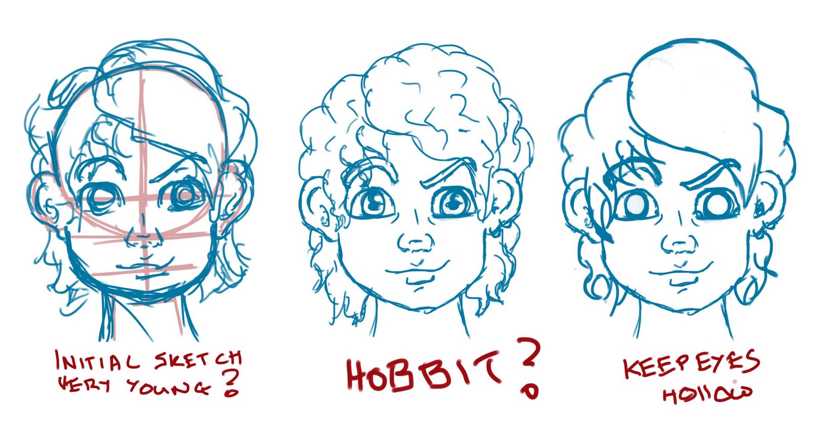
I liked the briefs for their character design aspect, I didn't like them for the applying to a range ect. There was so much more I could do, yet I didn't do this and the only thing I can blame is my poor time keeping abilitys, despite being in the study 5 days a week 9-6. This is something Lorenzo brought up today during group progress surgeries. I'm not a brief writer.

Despite being disappointed in myself I now know what I've got to do to make FMP work for me so my portfolio will reflect my design practice and my grade will reflect my efforts.

(posted on PPD)

Brief 1: Fixed Height

Fixed Dee's height so he doesn't look so tall instead of the five foot he should be. This will make it easier when I'm designing the other two characters who are taller. (Hence the five head worths.) I'll also apply this to the 3 point turns.

Made a quick height chart as well for when I've made the other two. Still a bald little Dee, but that can wait another day while I work on the 2nd character; Trevor.

Progress Surgeries Feed Back

The progress surgeries with Lorenzo with Lorenzo went well this morning. It was pointed out to me that I'm not actually very good at brief writing (which is true.) That I focus on too much trying to apply my designs to ranges ect that I lose sight of what it is that I'm about; which is the characters.

Another thing pointed out to me is that I should focus in more on the character and how they are perceived rather than writing an entire story and background to fit the characters. This is a trap that I hope I'll not fall into but I know there is a danger of it happening. I'm glad it was pointed out to me so I can try and avoid it.

Brief 1: Dee Face


Some quick faces and expressions of Dee I did this morning. I'm quite pleased with his form so far (apart from being still bald). I can now work on 3 point turns, some more expressions and a color pallet. I'll be giving each character a limited colour pallet. Dee's are looking likely to be green and yellow.

Brief 2: Assest Libary

1 of 3 briefs for the graphic novel brief. I'll be doing this brief and the actual brief for the issue.

Legally I am not allowed to blog anything more than this. For future reference please refer to my progress journal that I have started for this project.


(It acts like a blog but not on line.)

Tuesday 18 January 2011

Brief 1: Character 1


Just a quick re cap of the brief before I wrote it out in full.


Basic initial sketches of the first character; Dee-Ell. Took me a few try's to figure out the style and I realised I was working too young. Then I realised I was trying to re develop a style when I already had one that works pretty well.


He's still a little tall and a few tweaks need to be applied before I can finalise his initial designs before moving on to develop him further. I need to have the basic form of the characters before I can can think about costumes and every day clothes.

Edit: Very basic and rough profile view of a very bald Dee-Ell. I'm still unsure what to do with his hair but at least facial structure is looking consistent now. I'm not a very 'clean' illustrator; messy lines and jerky movements.

Case Study: Jeff Lemire

Jeff Lemire is a Canadian award winning cartoonist and comic artist. I first came across his art work when I was working at OK comics and his book The Essex County Trilogy was displayed on the counter. Just after I found that, his Vertigo series Sweet tooth came out and I've been hooked ever since.


His other work includes The Nobody, a two-color tale of identity, fear and paranoia in a small community. Wrote the one-shot Brightest Day: Atom, with Turkish artist Mahmud Asrar, which was designed to act as a springboard for an Atom story to co-feature in Adventure Comics. His latest work was relaunching the Superboy series featuring the character Conner Kent.


Lemire's style of art is not the first thing that pops into a persons mind when you mention comic book art. However, it's a style that works, it's great for story telling and he's able to capture emotion so perfectly (especially in the later Sweet Tooth issue) Definitely one of my favourites.