
Showing posts with label Brief 5; New Scientist. Show all posts
Showing posts with label Brief 5; New Scientist. Show all posts
Friday, 3 June 2011
Tuesday, 5 April 2011
Sunday, 3 April 2011
UV Deer
Reindeer see their world in glorious ultraviolet, helping them find food and avoid predators.
Most mammals, including humans, see using light from the visible part of the spectrum; ultraviolet light, which has a shorter wavelength, is invisible. But not so reindeer, says Glen Jeffery of University College London.
The frozen wastes of the Arctic reflect around 90 per cent of the UV light that hits them; snow-free land typically reflects only a few per cent. So Jeffery and colleagues wondered whether reindeers had adapted to their UV-rich world.
In dark conditions, they shone LED lights of different wavelengths, including UV, into the eyes of 18 anaesthetised reindeers while recording with an electrode whether nerves in the eye fired, indicating that the light had been seen. The UV light triggered a response in the eyes of all the reindeer.
"Since migrating to the Arctic 10,000 years ago, these animals have adapted incredibly quickly," says Jeffery.


Saturday, 2 April 2011


 Trying to work out which composition would work best for this cover. I quite like the layout for the top one, referring back to the key word 'clone'.
Cover:

Finished cover. There is something a little off about it and I think it's because I've flipped the image and the head wasn't exactly straight.
Edit:

This sits better with me and the page.
Step by Step
 Lines
Lines Flats
Flats Shade (Purple, multiply overlay 60%)
 Outer colour
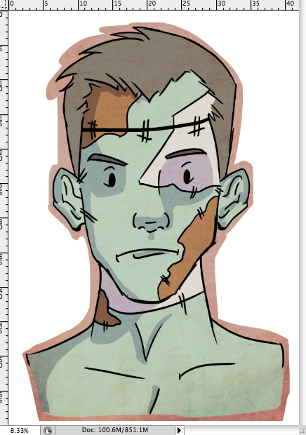 Then a series of textures, overlays.half tones and gradients.


 Final illustration. But I've not yet figured out how it's going to sit on the cover page.
Frankenstein syndrome: Why do we fear making humans?
"From IVF to artificial wombs, why does each advance in reproductive technology still conjure up visions of monsters or Hitler clones?"
(I wonder about the sanity of people dreaming up Hitler Clones)
For this cover I started out not wanting to draw the obvious Frankenstein monster. I wanted to focus it in more on the cloning aspect and peoples perceptions of what that means. Then I realised I had already draw a baby in fetal position and there was only so many times I could get away with that.
So I thought of Sally:

This patch work Frankenstein monster inspired character reminds me of the article because it's people questioning how far we'd go. We already have donor cards, How is that so different from cloning?If we can use bits of people to patch up others, then surely that's no different from creating something new (and possibly there would be less of a chance of the body rejecting something cloned from them rather than an alien intrusions that white blood cells would attack.)
 Started out with a normal, albeit tin tin, looking man.
 Typical Frankenstein attributes.
 Started to add the patchwork instead.
Covers So Far


Finished covers so far, 3 more to go. (I think I'm going to go with 7 in the end). It was pointed out to me that perhaps the diabetic covers doesn't stand up much to the others. (And that I should either drop it or re do it.)
Friday, 1 April 2011
Ghoulish.2
 Lately I've favoured using messier lines in my artwork, going over the neater lines and bringing a bit more life to them.
 Flats
Flats Shading and textures.
 More textures and done.
I decided to keep the background white after playing around with a black and then a gradient BG. Neither of them worked, and I think the white plays well off of the image.
Tuesday, 29 March 2011
Ghoulish
Reading up about the invention that Disney has made to fool gamers into believing there are thing's on their skin when they play reminded me more and more of something far sinister. If they can make you feel something internally like fear, then the next step is to make that fear external. That was the idea for this illustration.
 Child playing with a tv and games console. (An older box like tv because what parent would give a child a flat screen) And a terrible looking ghoul/ghost/national lottery thing.
 The ghoul coming up and out of the games console.
\
 Centralised the image and made the composition a little easier on the eyes.


Yup, changed it to a flat screen.
New Article
 New Scientist article I've recently found to illustrate and I've think I have a good idea for it.
Thursday, 10 March 2011
Genius Toddler
Toddler Know Counting Rules At 18 Months.
I think this is the last New Scientist Brief I'm going to do this week. Going to leave it a few days to concentrate on more substantial briefs.
This is going to be one of the quicker and simpler ones and I'm drawing a character this time so I'm more in my element.
"Months before they begin to count, toddlers are teaching themselves the rules of counting. A new study suggests this starts sometime between the ages of 15 and 18 months."
This is going to be one of the quicker and simpler ones and I'm drawing a character this time so I'm more in my element.
"Months before they begin to count, toddlers are teaching themselves the rules of counting. A new study suggests this starts sometime between the ages of 15 and 18 months."
For this cover I'm simply going to draw the image of a toddler either counting numbers in his head and holding an abacus or something to that effect.


Quick fix when I flipped the image and checked it. It was a bit squashed. One side of the face going out farther than it should have and one of his eyes was running away.

Ok, that's enough fixing.

Rough idea of what I'm going for. The toddler in the bottom of the page with a background of mathematical equations.

Clean inks.
Wednesday, 9 March 2011
Green Machine
 3 of 7 finished for the New Scientist cover brief.
Overall I'm pleased with how this one has turned out. There is an added focus with the additional text and it makes it seem more like an actual cover for the magazine.
Tuesday, 8 March 2011
Power Grid
Quick illustration for the New Scientist cover brief. I took the image from the article and sketched out the lamp post and went from there. My idea is that the lamppost acts like a plant during photosynthesis, taking in the energy (in this case, solar) from the sun and 'feeds it' via roots back into the National Grid.

The sun so far:

I am enjoying the fact that all the pieces look illustratively different.Where as the Diabetes cover leaned more towards Vector, the Space baby with a decidedly messy feel and this one with its cleaner lines. I think it works well for the style choice and the message behind the images.


Changed the structure/terrain of the ground and made it seem more earth like.


It's getting there. But at this point, the lamps and roots are starting to look a little dead. I'm going to tweak the colours and see if I can't make it more natural looking.

Made the lamps and roots green though I may play around with making the roots lighter. I'm also thinking of adding some plants and clouds but I'm not sure if that'll be over kill or not. (Also, it may stray from the original topic)

Show the difference in roots colour. Also just annoyingly realised I'm working in RGB and not CMYK.
 FIN. I'll ask Lorenzo later whether or not I should add clouds or if I should just sign this one off.
Applied to the template. Flipped the image so the background of the text didn't look too busy. I'm might just leave it like this, yet my in crit last week it was suggested that I added more text to suggest other articles.
Subscribe to:
Posts (Atom)