
Showing posts with label Brief 4; Tantarra Mascot. Show all posts
Showing posts with label Brief 4; Tantarra Mascot. Show all posts
Friday, 3 June 2011
Tuesday, 12 April 2011
Aditional Pages
 The About page is similar to the Home page,
 The Fiction index would have a scroll bar for a reader to browse through the books available to read. (So far they only have one, but it's an on going project so...) The blank boxes are place holders for possible book covers/art work.
 The layout for the fiction/chapters. It's 12 lines per page with a scroll bar. On the left hand side are clickable links to take a reader to the next page ect.
 And because I personally prefer reading light on dark text I've added a light/dark feature that would invert the text and add a solid background.
Monday, 11 April 2011
Background
 I started with larger silhouettes of the mascot on a light background, but it didn't seem to sit right.
 Used a darker blue that was lifted from the mascots colour scheme, but I think the silhouettes are still to big.
 Dark gray background, same as the text, without the mascots.
Mascots at 5% opacity, tilted and set against the same gray background. This should keep attention on the middle of the page and it less of a distraction.
Fixed Grids


 Just had to shift some items across to adhere to the grid. I'm going to work on something for the background when the window is stretched on viewed on a wide screen otherwise there's going to be too much white space and the site will be lost somewhere in the middle.
Website Development

I'm still note sure if I have website grids figured out yet. I keep trying to make it fit to screen, when in reality websites sit firmly in the middle. (And the white space around it is interchangeable/scalable between different browsers ect.)
Sunday, 10 April 2011
Website Layout
As the Tantarra mascot is for a web presence, I've decided to go ahead and apply it to a web site temple.
I aim to make the website simple and easy to navigate, taking int consideration that this will be a mostly text heavy site.
Initial Sketches:


I think I'm going to develop the 2nd one as it shows the Mascot almost in full. I still want to retain a simple layout with the use of too many colours that would distract a reader.
Friday, 8 April 2011
Mascot Progress
I pretty much have the mascot for Tantarra complete. I spent last night talking to the client and working through what colours they thought would work best and blue was decided upon. (Which was what I was going to go for in the first place.) There is a couple of things I might have to change like the pattern on the abdomen. (They did send a picture, I just seem to have misplaced it.)
 Finished Lines. Changed the torso slightly so it looked less like it had been broken in half and twisted painfully. Slightly altered the position of the arms.
 Basic flats, normal body colour and blue for he rest of the spider.
 Added the white hair and blue eyes, as well as the gradient that runs from the torso into the spider. (And another dark to light gradient that also helped me with remembering where my light source was for shading.)
 Changed the bleding mode of the shade to better suit the high contrast feel of the image.
 Hair shade as well as added a texture that started to soften out the blend between the two different colours on the body.
 And another gradient for all over, this time a vibrant pink and orange set to screen mode.
Thursday, 31 March 2011
It's Not A Vector~
I'm not a great illustrator, I'm not even an incentive one. I'm quite bland in that aspect really.
However, one thing I am not is a vector artist. Someone pointed out not too long that because I prominently used the pen tool in photoshop to create my digital lines means that I was creating a vector (and clearly nothing else.)
I pointed out that a) you can't create vectors in photoshop as it is a bitmap program and not a vector program like illustrator. Example:
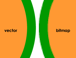
On the right is a zoomed in shape created in a bitmap program such as Photoshop. The one on the left is created in a vector like program.
My b) point (or should that be 2nd?) is that I wasn't comfortable enough to create lines without the pen tool. I'm still not, but I have been practicing:
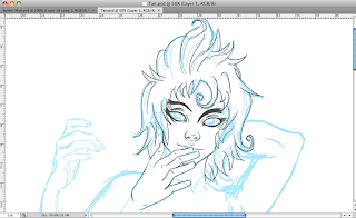
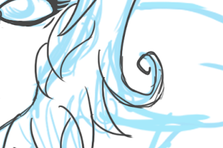
And by my lines being 'messy', I sill haven't quite got the motor control to make them neat. I guess that's why with some of my work I've started to use the messier approach to digitally inking. (and it's proving quicker, which is an added bonus.)
However, one thing I am not is a vector artist. Someone pointed out not too long that because I prominently used the pen tool in photoshop to create my digital lines means that I was creating a vector (and clearly nothing else.)
I pointed out that a) you can't create vectors in photoshop as it is a bitmap program and not a vector program like illustrator. Example:

On the right is a zoomed in shape created in a bitmap program such as Photoshop. The one on the left is created in a vector like program.
My b) point (or should that be 2nd?) is that I wasn't comfortable enough to create lines without the pen tool. I'm still not, but I have been practicing:

And by my lines being 'messy', I sill haven't quite got the motor control to make them neat. I guess that's why with some of my work I've started to use the messier approach to digitally inking. (and it's proving quicker, which is an added bonus.)

Also, bitmap!
This is at 200% so here's hoping it will look neater when scaled down to the size the client wants it at.
This is at 200% so here's hoping it will look neater when scaled down to the size the client wants it at.
Arms a plenty~
 I'm trying to keep to the specific guidelines set down by the client which was "more arms", other than that, I think they're keen for me to keep going.
I'd been putting off this brief because I was waiting for confirmation from the client, but now I have it and I can finish this up by the week is out.
There are a few things I want to address such as making him seem more mythical and less like half a demon god stuck to a poor decapitated black window. (as that was the spider I was basing the body on.)
Edit: I can't draw hands all that well. I think two of them have been attached together at the elbow. Whoops.
Tuesday, 29 March 2011
Mascot Update~
 I fixed the mascots face, his body is still looking a little twisted but that could just be the angle he's at. I need to add the four other arms, finish the draft and send it off to the client for approval.(or too see if there are any changes) before I can ink and colour. Then hopefully that's another small brief down.
 Wednesday, 23 March 2011
Said The Spider To The Fly~
So my clients finally decided what they wanted for their mascot and I'm under the impression that it's some kind of spider centaur. Either way, that's what they're getting and I'll run the sketch past them alter tonight when I'm done with it. (And to see if they want any changes ect.)
Here's how it looks so far:


Here's how it looks so far:

And now to completely mess up and try and add four other arms on an all ready crowded body. Good job I like spiders.

Goodness me, lots to fix and arms to add. Flat face, twisted torso, awkward arm. Good job it's just a quick sketch. I'll go back and rectify that before I even consider sending it to the client.
Monday, 14 February 2011
Define : Mascot
For one of my live briefs, I've been asked by the client to design them a mascot for their website (as well as 2 additional character designs.) For now I'm going to concentrate on the mascot as that is the clients main priority.
According to good old Google, a mascot is:
The twitter bird :
 The Twitter birdie, supposedly, represents anticipation, fun and the tiny size of tweets. Apparently, birdie was bought for just $6, $29 less than Nike paid Carolyn Davidson for the Swoosh logo. I'm not sure if that's a bargain or a rip off.
And their Fail Whale:

DeviantArt: Fella. (Which I can't stand the sight of and I'm not sure why.)
 Ask.Com Jeeves:

Only available on the UK version. Full body, full coloured character. (Something akin to what my client wants but I'm still weighing out the options.
According to good old Google, a mascot is:
- A person or animal that is adopted by a team or other group as a symbolic figure.
- The term mascot – defined as a term for any person, animal, or object thought to bring luck – colloquially (informally) includes anything used to represent a group with a common public identity, such as a school, professional sports team, society, military unit, or brand name.
The twitter bird :
 The Twitter birdie, supposedly, represents anticipation, fun and the tiny size of tweets. Apparently, birdie was bought for just $6, $29 less than Nike paid Carolyn Davidson for the Swoosh logo. I'm not sure if that's a bargain or a rip off.
And their Fail Whale:

DeviantArt: Fella. (Which I can't stand the sight of and I'm not sure why.)

 Ask.Com Jeeves:
Only available on the UK version. Full body, full coloured character. (Something akin to what my client wants but I'm still weighing out the options.
Thursday, 20 January 2011
Brief 4: Live Brief

 Currently corresponding with an author who wants a few character designs for their fiction website. While it's not a safe for work website (and still in the process in getting itself up and running) it is something I am interested in taking on. I'm also in discussion with this being a long term side project in which I'm paid for doing the art work for the site.
I'm going to write a brief this weekend for the client to agree with and then I can get started on initial ideas and concepts.
Subscribe to:
Posts (Atom)